启明办公

 找回密码
 立即注册
搜索
热搜: 活动 交友 discuz
查看: 107|回复: 0

iCSS学习(2)---条纹边框的多种实现方式

[复制链接]

3

主题

3

帖子

9

积分

新手上路

Rank: 1

积分
9
发表于 2023-1-17 14:29:49 | 显示全部楼层 |阅读模式
来自 https://github.com/chokcoco/iCSS/issues/1
实现如下的条纹边框的效果,你能想到多少中方式呢?


1.border

border属性:border-width、border-style、border-color
其中 border-style:
mdn官网:
属性解释
none和关键字 hidden 类似,不显示边框。在这种情况下,如果没有设定背景图片,border-width计算后的值将是 0,即使先前已经指定过它的值。在单元格边框重叠情况下,none 值优先级最低,意味着如果存在其他的重叠边框,则会显示为那个边框。
hidden和关键字 none 类似,不显示边框。在这种情况下,如果没有设定背景图片,border-width计算后的值将是 0,即使先前已经指定过它的值。在单元格边框重叠情况下,hidden 值优先级最高,意味着如果存在其他的重叠边框,边框不会显示。
dotted显示为一系列圆点。标准中没有定义两点之间的间隔大小,视不同实现而定。圆点半径是border-width 计算值的一半。
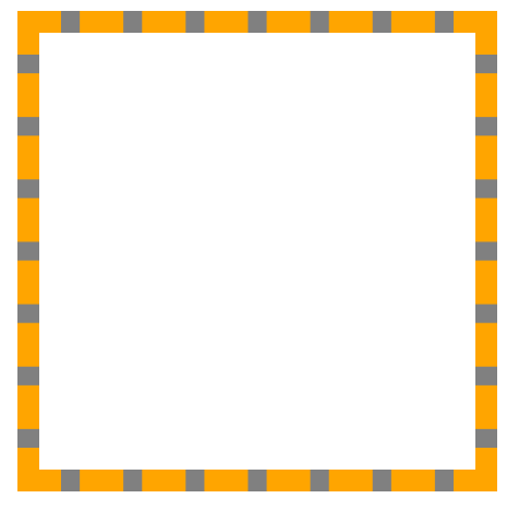
dashed显示为一系列短的方形虚线。标准中没有定义线段的长度和大小,视不同实现而定。
solid显示为一条实线。
double显示为一条双实线,宽度是 border-width。
groove显示为有雕刻效果的边框,样式与 ridge 相反。
ridge显示为有浮雕效果的边框,样式与 groove 相反。
inset显示为有陷入效果的边框,样式与 outset 相反。当它指定到 border-collapse为 collapsed 的单元格时,会显示为 groove 的样式。
outset显示为有突出效果的边框,样式与 inset 相反。当它指定到 border-collapse为 collapsed 的单元格时,会显示为 ridge 的样式。
<!DOCTYPE html>
<html lang="en">
     <head>
         <meta charset="UTF-8" />
         <meta http-equiv="X-UA-Compatible" content="IE=edge" />
         <meta name="viewport" content="width=device-width, initial-scale=1.0" />
         <title>Document</title>
         <style>
             .box {
                 width: 200px;
                 height: 200px;
                 background-color: gray;
                 border: 10px dashed orange;
                 position: relative;
             }
             .box::after {
                 content: '';
                 position: absolute;
                 top: 0;
                 left: 0;
                 bottom: 0;
                 right: 0;
                 background-color: #fff;
             }
         </style>
     </head>
     <body>
         <div class="box"></div>
     </body>
</html>2.反过来使用伪元素来制作边框的背景

<!DOCTYPE html>
<html lang="en">
     <head>
         <meta charset="UTF-8" />
         <meta http-equiv="X-UA-Compatible" content="IE=edge" />
         <meta name="viewport" content="width=device-width, initial-scale=1.0" />
         <title>Document</title>
         <style>
             .box {
                 width: 200px;
                 height: 200px;
                 background-color: #fff;
                 background-clip: padding-box;
                 border: 10px orange dashed;
                 position: relative;
             }
             .box::after {
                 content: '';
                 position: absolute;
                 top: -10px;
                 left: -10px;
                 bottom: -10px;
                 right: -10px;
                 background-color: gray;
                 z-index: -1;
             }
         </style>
     </head>
     <body>
         <div class="box"></div>
     </body>
</html>关于 background-clip的解释:
设置元素的背景(背景图片或颜色)是否延伸到边框、内边距盒子、内容盒子下面。
border-box
背景延伸至边框外沿(但是在边框下层)。
padding-box
背景延伸至内边距外沿。不会绘制到边框处。
content-box
背景被裁剪至内容区(content box)外沿。
text 实验性
背景被裁剪成文字的前景色。
回复

使用道具 举报

您需要登录后才可以回帖 登录 | 立即注册

本版积分规则

Archiver|手机版|小黑屋|天恒办公

Copyright © 2001-2013 Comsenz Inc.Template by Comsenz Inc.All Rights Reserved.

Powered by Discuz!X3.4

快速回复 返回顶部 返回列表